Butterfly Effect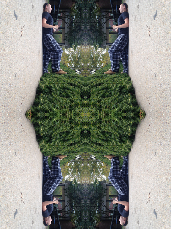 For the butterfly effect, I changed the canvas size and moved the original photo to the top corner. I then copied the layer and flipped it to the other side. I did that again but this time I flipped it downwards. Finally, I flipped in once more to the side. This created the butterfly effect.
0 Comments
Hockney Style Edit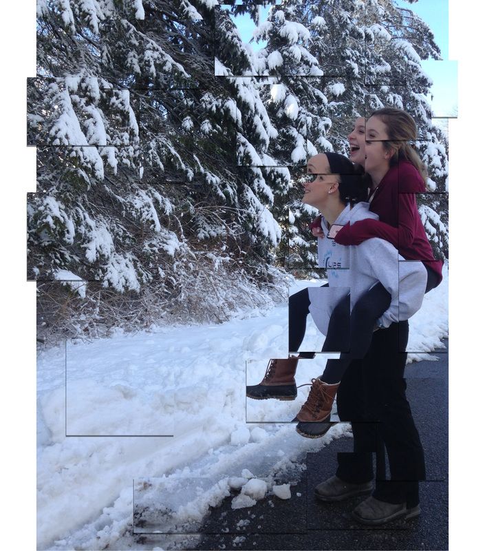 For the cubist photo, we edited the photo using Photoshop. I selected a part of the photo and copied the layer and moved it around on a separate layer. I did this for multiple parts of the image. I then added a shadow to each layer creating the effect that the different layers looked more raised up and that they were all separate pictures. This was modeled after David Hockney, who is a photographer who would take separate pictures of one thing to show the passage of time. With this effect, it looks like separate pictures of a single subject.
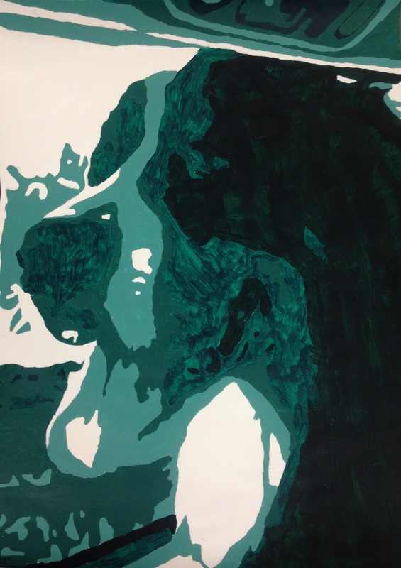 This is a picture of my dog, and I edited it in Photoshop using the cutout option in the filter gallery, and then using the new image I created a gradient map. After creating the map, we projected the picture onto the wall and I traced it using a pencil. Then, I marked where each color of paint would go, and painted the traced image.
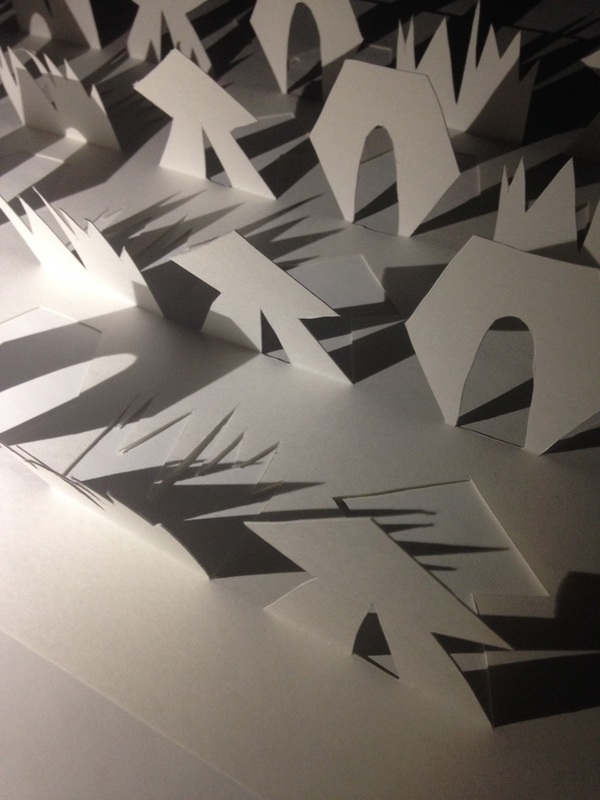
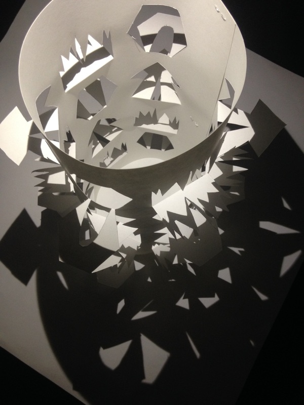
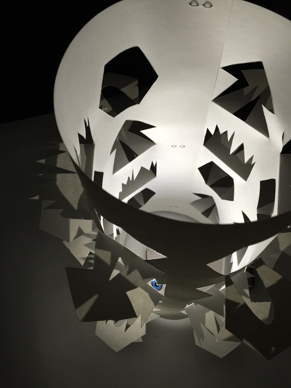
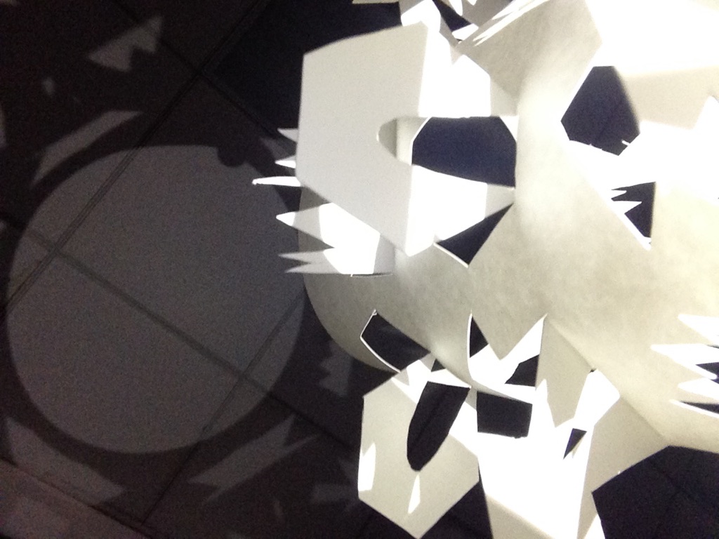
To make the shadows shown, we first had to make a pattern in Adobe Illustrator. Then we printed it out, and cut it using thick paper and a thin, sharp knife. After the lantern was completed, we were to take photos of the shadows created by the lantern. To take these photos, I tried having the light source come from all different angles, and I made sure to get a piece of the lantern in each photo I took. The light source I used was the flashlight from an iPhone, and I took these photos using my iPhone 5c.
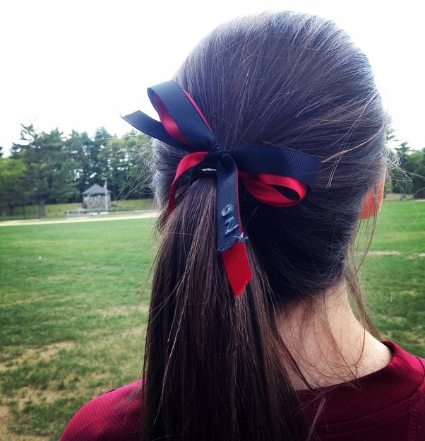
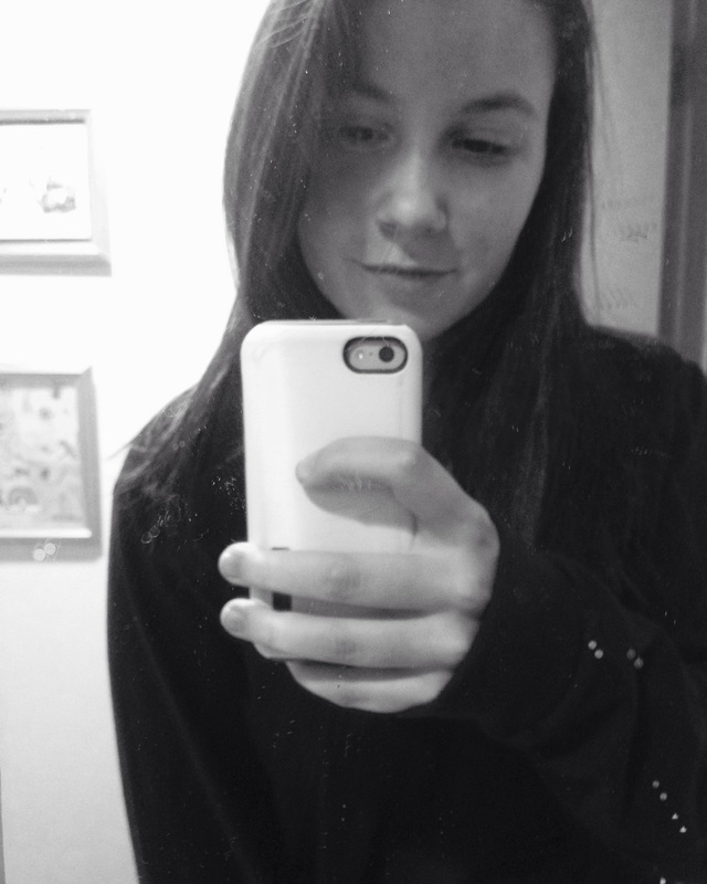
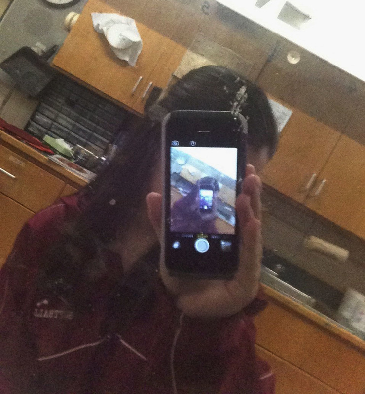
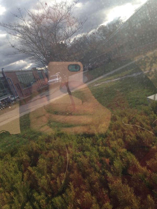
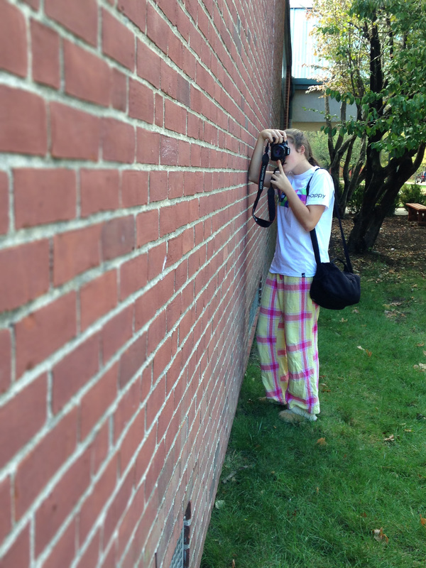
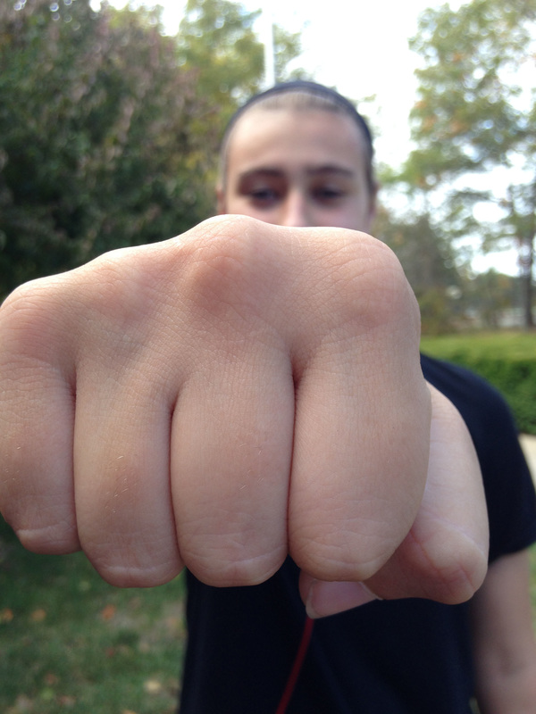
PortraitsI think the selfie is a modernized self portrait. I like selfies better because they are set up how you want them where as a portrait is more previously decided, it's more rigid. For the first picture, I had my friend take the picture, but it was my idea. The second picture is just a regular selfie that I took previously. The third picture was taken using using the blackness of a computer screen, and I positioned the camera so that it showed the camera and it had this cool effect on it. The last picture is my favorite. It was an extra that I took using a window. I like how it kind of looks like a double exposure. I think the first, the second, and the third photos are the best representation of me. All these photos were taken with my iPhone 5c.
Alphabet Project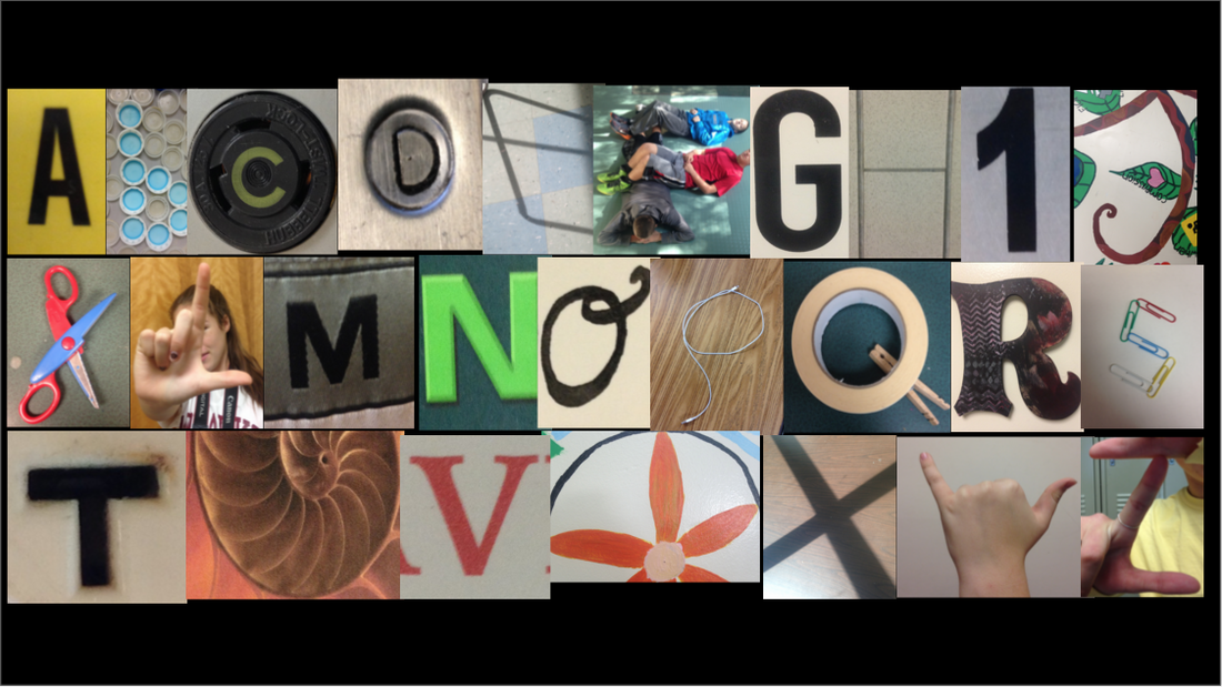 I took these pictures with my iPhone 5c, and I found the letters in my school. I cropped some of the pictures in my photo library and some of them on my phone. I created this final picture using Google Slides.
Pen Tool Practice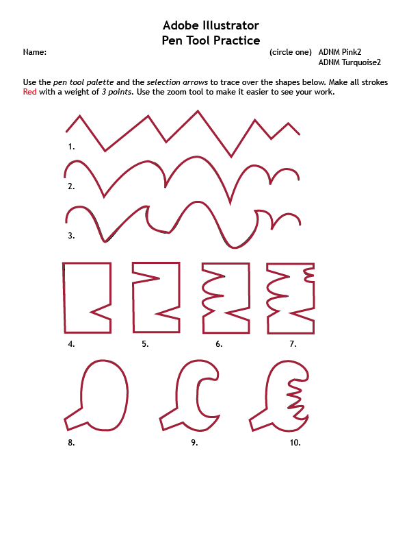 We used the pen tool in Adobe Illustrator to trace over lines that already existed so that we could practice before doing a different assignment. This was review.
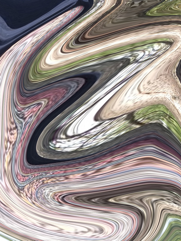
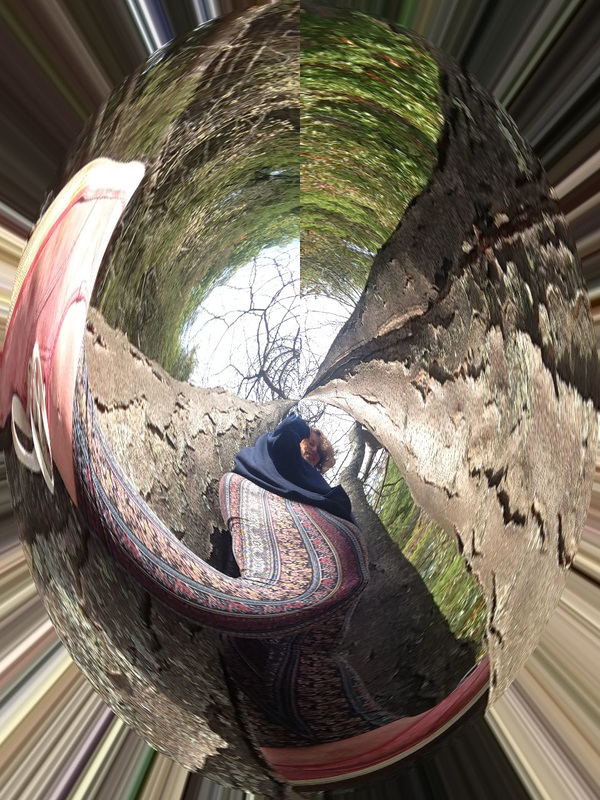
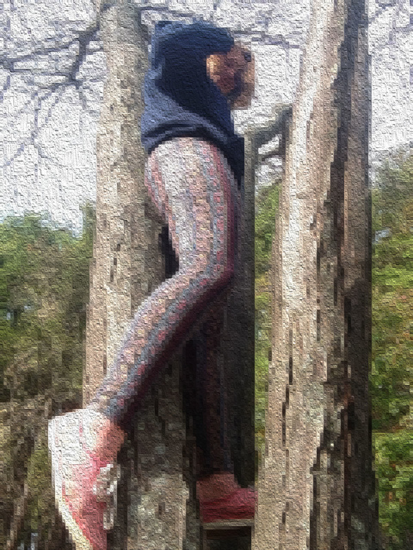
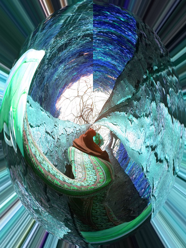
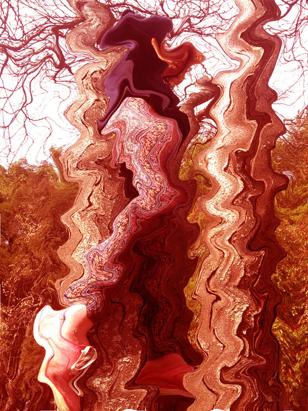
Subject MatterRealistic art is the original image before you edit it and it looks real. With abstract art, you can still see what the image is, it's just distorted a little. Finally, non-objective is when you can't tell what the original image was. The is a fine line between non-objective and abstract. Extra Abstract ArtDepth of field is where the focus of the picture is, or which part of the picture is in focus. Aperture relates to depth of field because the lower the aperture, the shallower the depth of field. The aperture effects the focus of the picture. To vary the depth of field, I used the tilt-shift effect in Photoshop. I took all these photos with my iPhone 5c.
|
AuthorMy name is Amanda. This is my blog for my Photography class. Archives
June 2016
Categories |

 RSS Feed
